I just finished another illustration, and I want to walk through the references and decisions that shaped it, because this one took a lot of both.
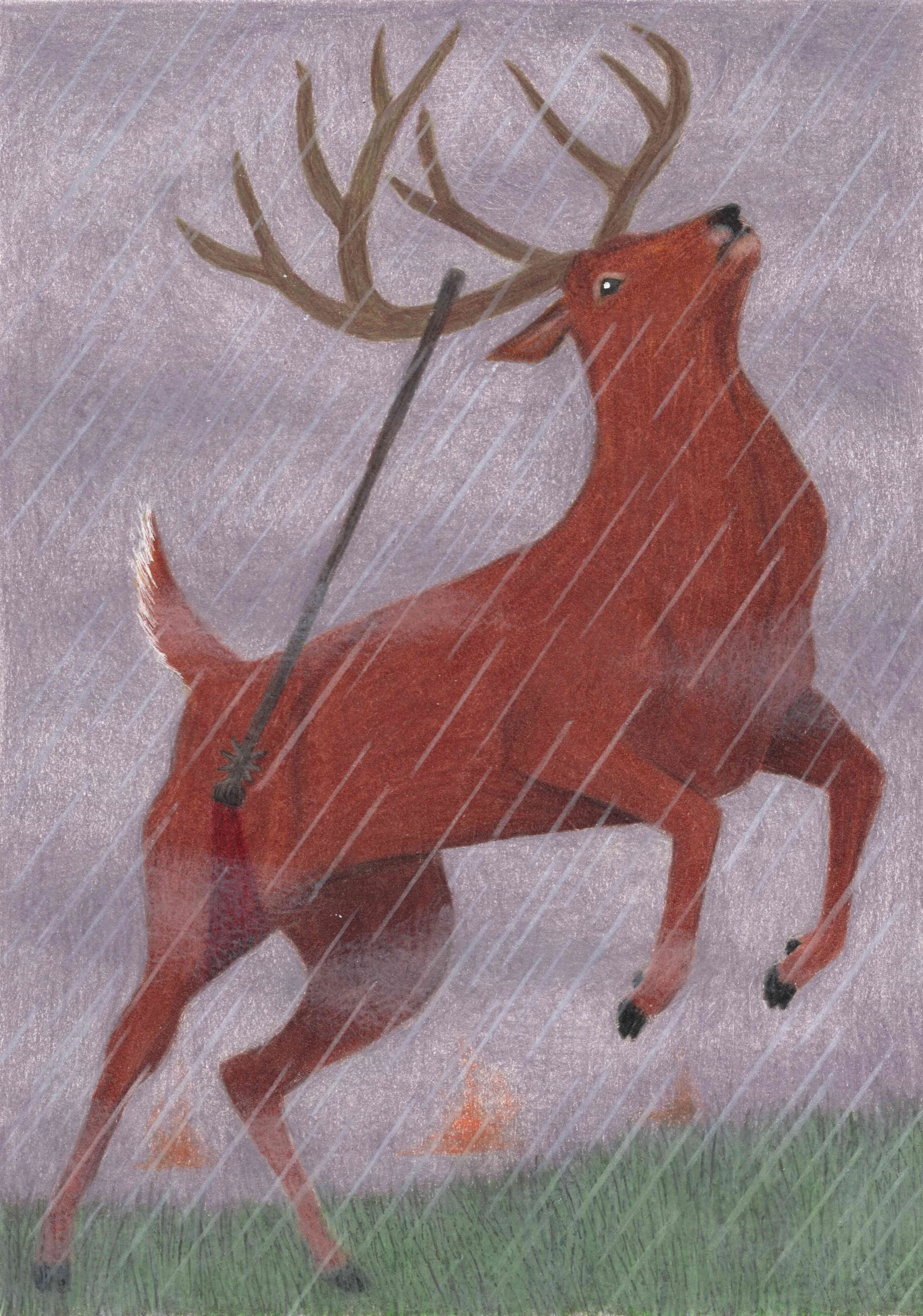
This one took a lot of references; I had a very specific pose in mind for this character. He is described as wheeling and leaping with agility. The moment he is speared is supposed to represent a downfall for one of the most powerful protective characters in the book; June is truly on her own when he is injured.
Body and position
Because I am making these illustrations to fit the pages of a book, I needed the composition of the post to be quite vertical. That eliminated the option of using a leaping deer. I decided instead to show the character either rearing up or taking off/landing a jump. However, in most of the reference images I was searching they also tended to look slightly awkward when rearing up or landing a jump.
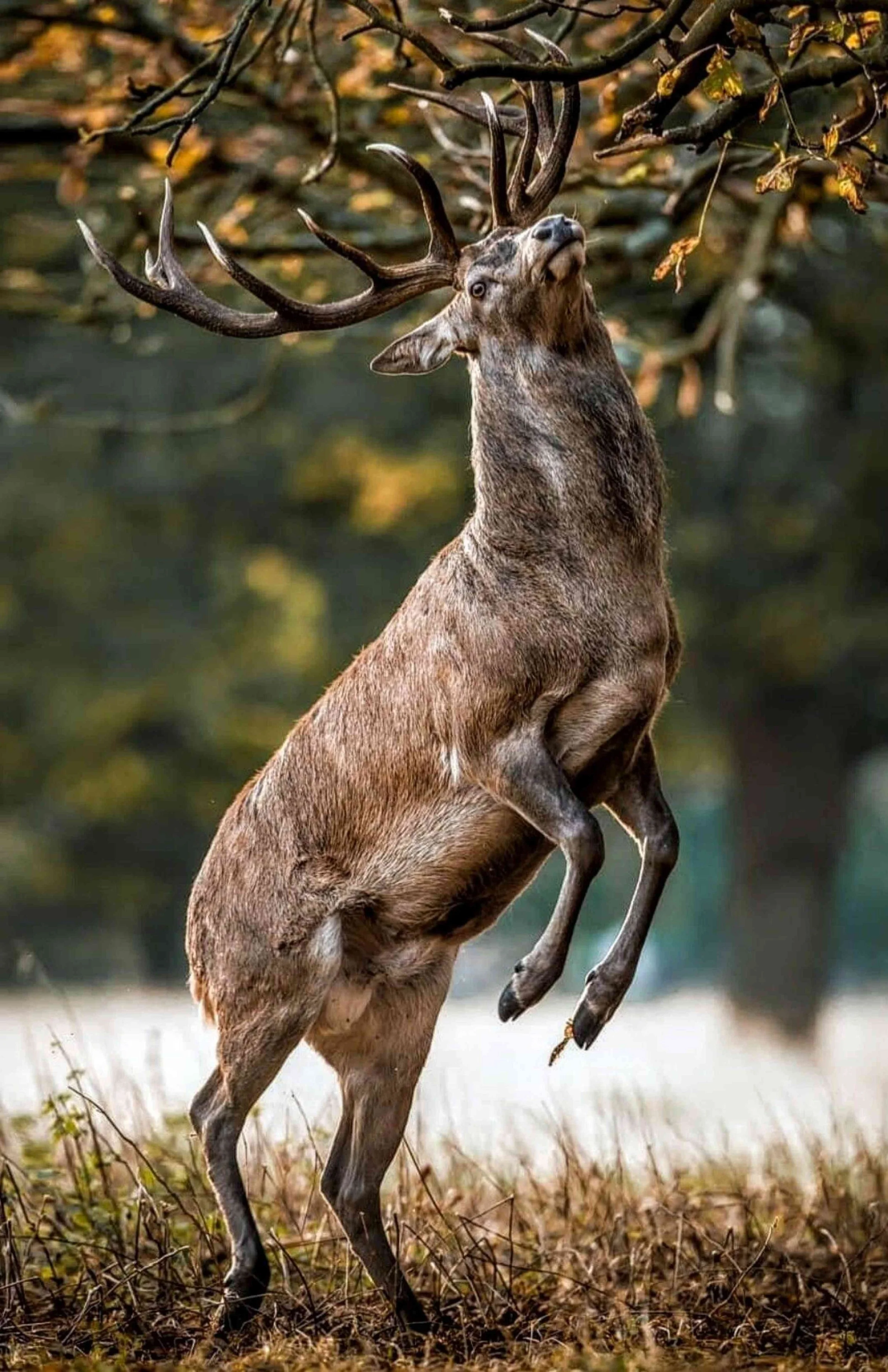
Photo © Alex Saberi
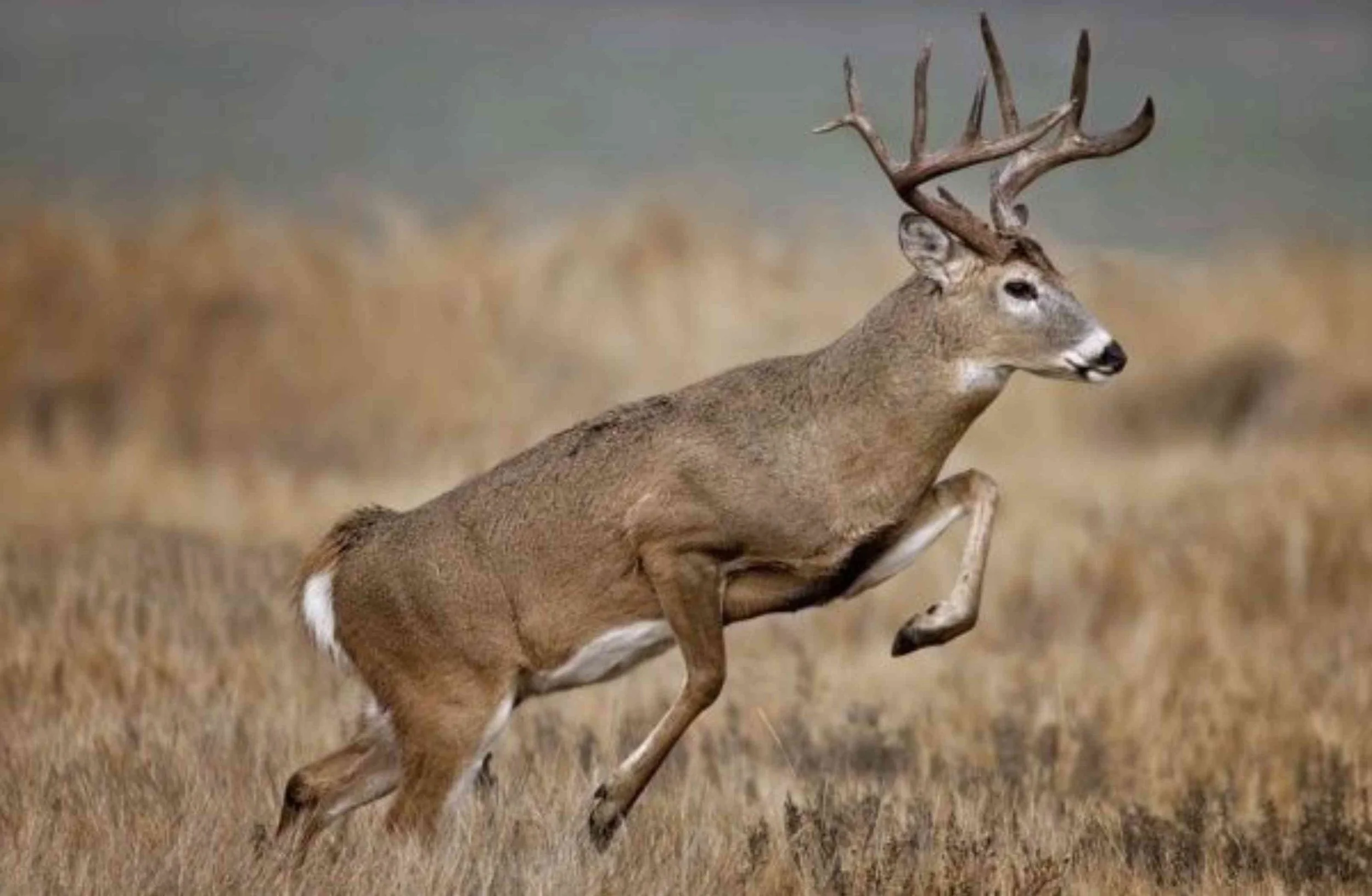
Photo © Donald M. Jones
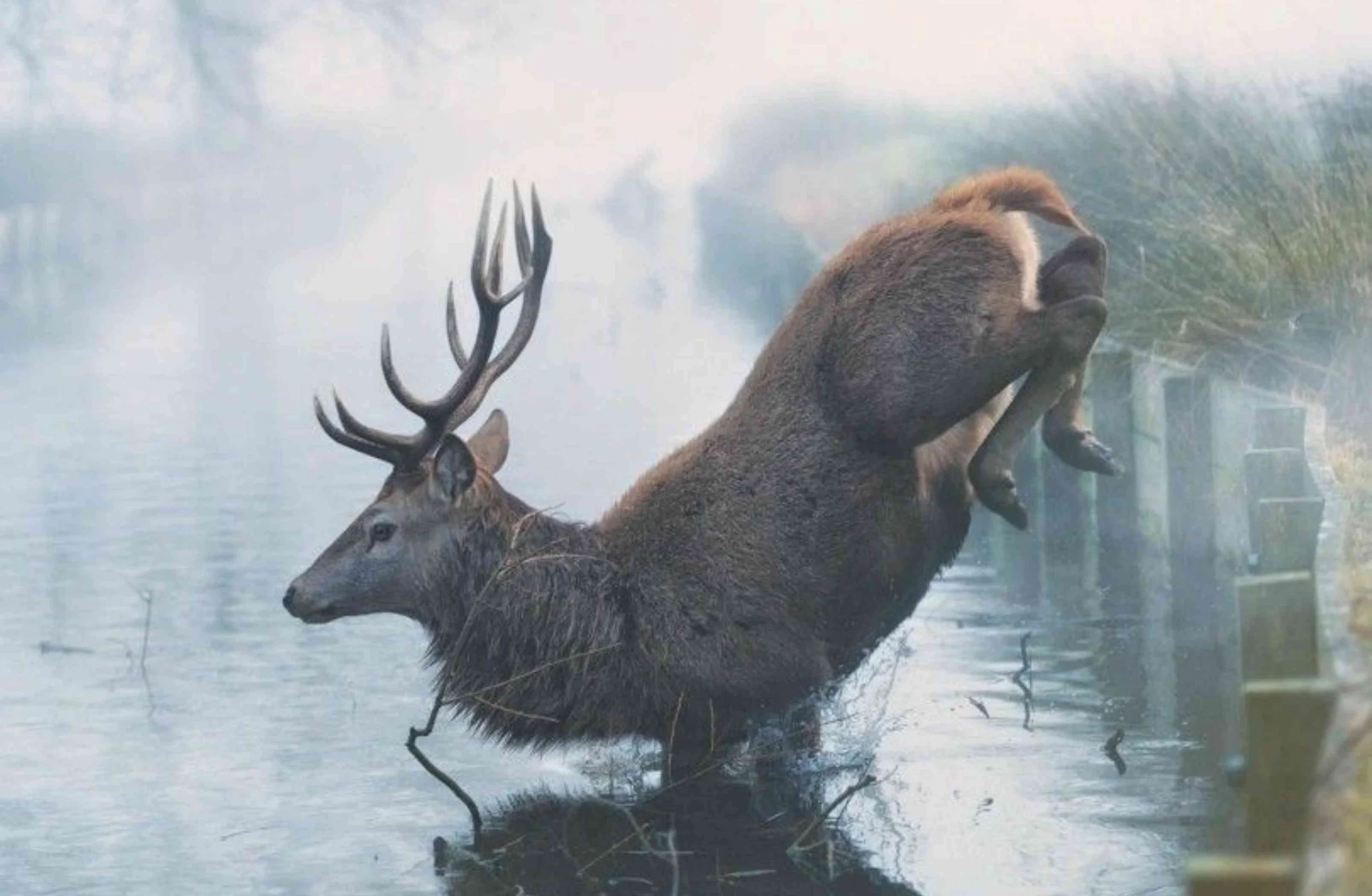
Photo © Max Ellis
But you know what similar animal looks extremely majestic in those circumstances? A horse:
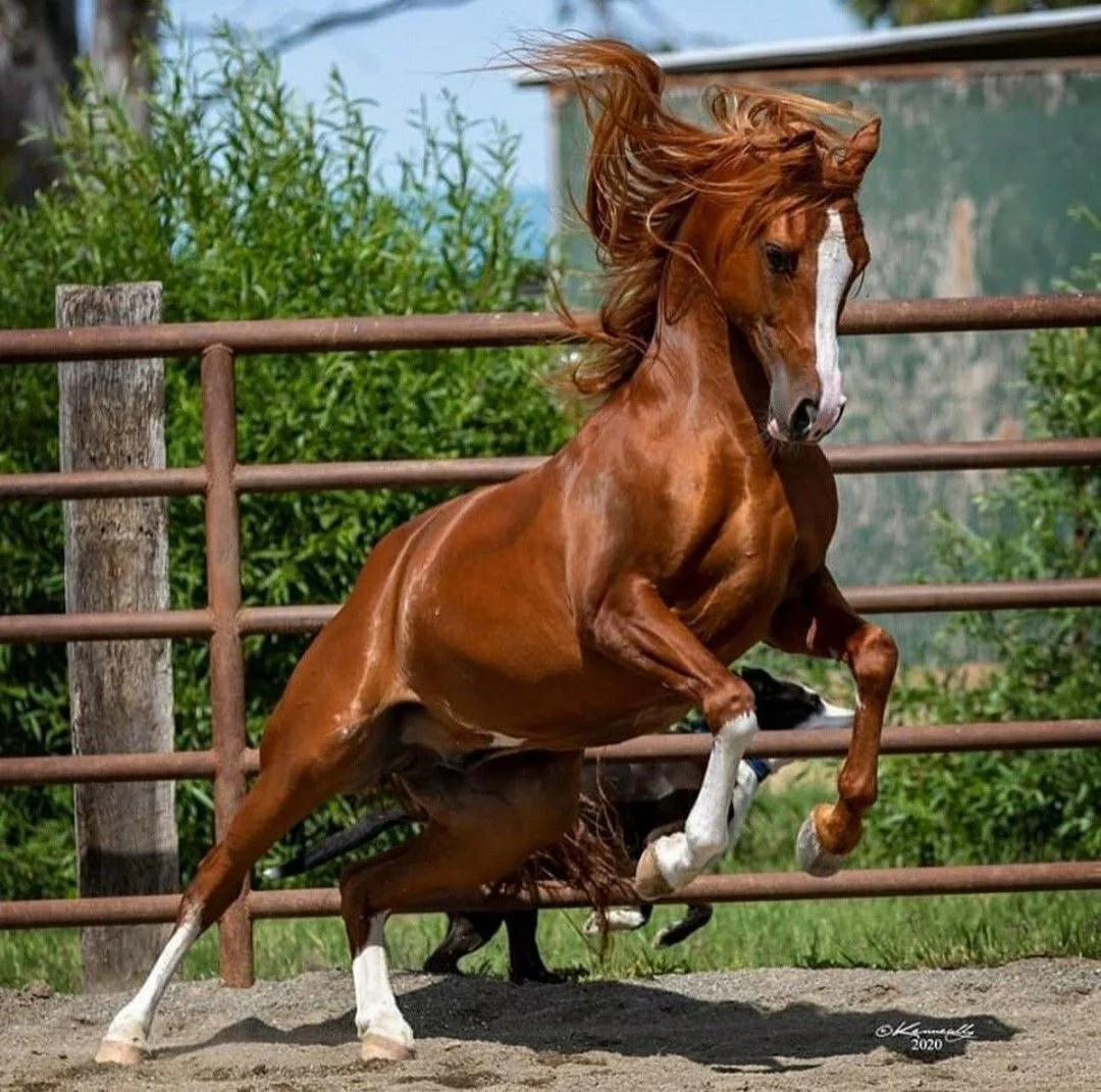
Photo © Kelly Kenneally
This image contains the power and majesty I wanted to portray much better than any reference image of a deer I found. Deer are beautiful animals but they tend to be squarish in shape and they do not tend to show a lot of musculature. I decided to go in a less realistic direction and use this image as a reference to draw a deer-horse hybrid.
This presented some issues, however. My first thought was to use the horse for the reference for the entire body, and pop on a deer head. But when trying to sketch that out it looked off, and sort of dragon-ish:
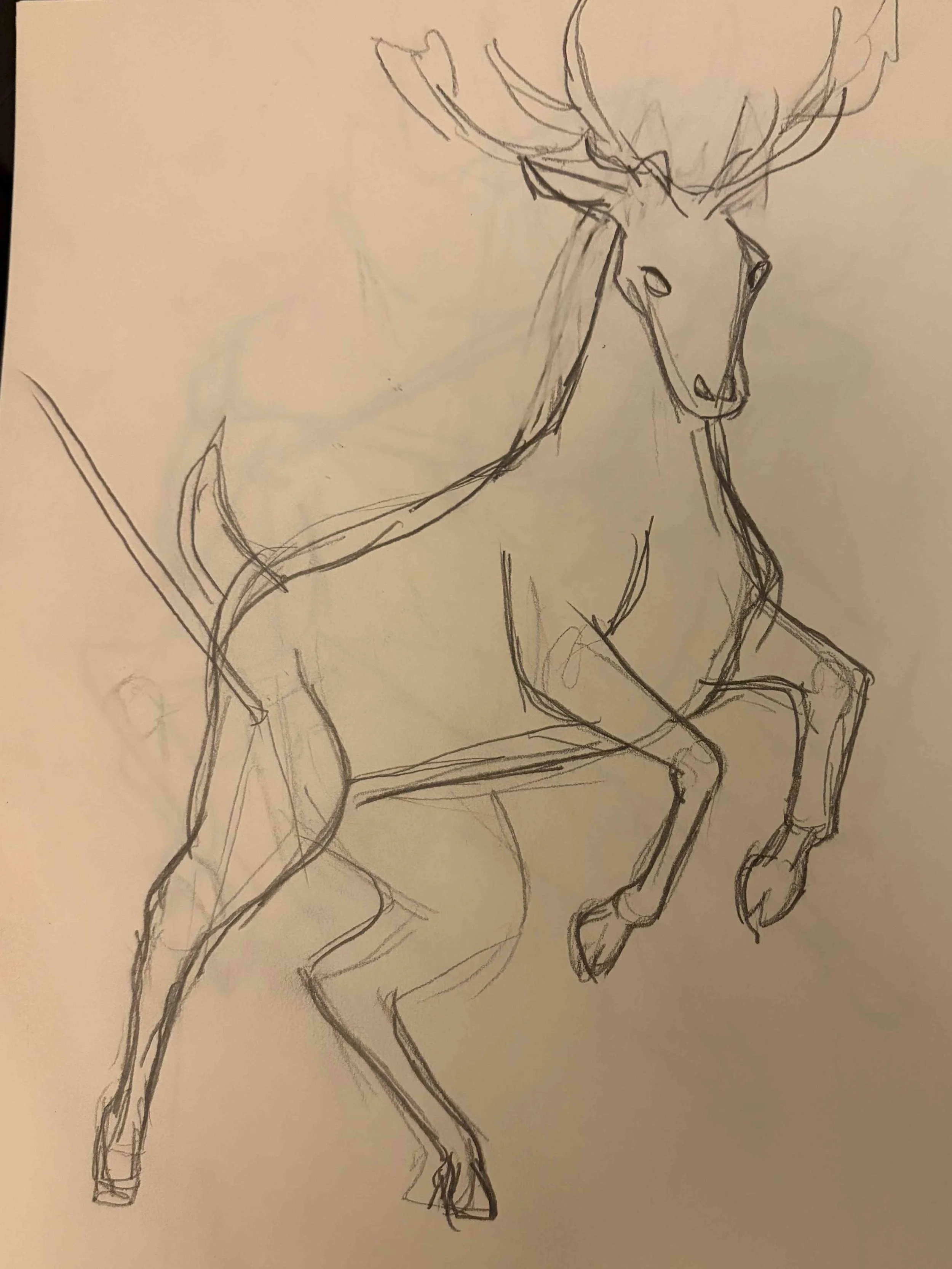
The main giveaways were the size of the hindquarters and the curve of the neck. You can kind of see where I tried to straighten the neck out and reduce the size of the hips, but it didn’t totally work.
So I brought in reference number two. I used the neck and head position from this photo:
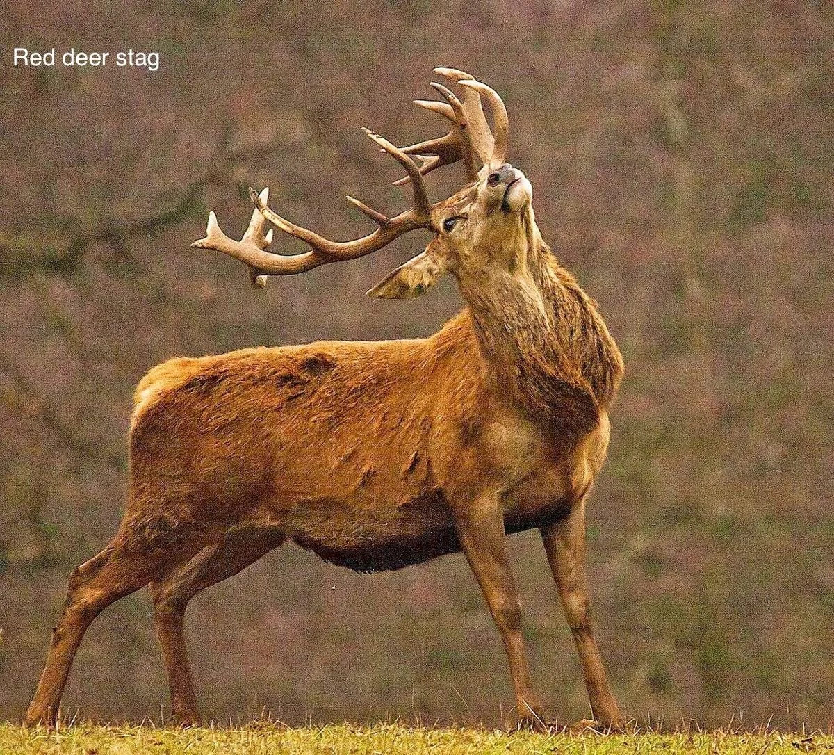
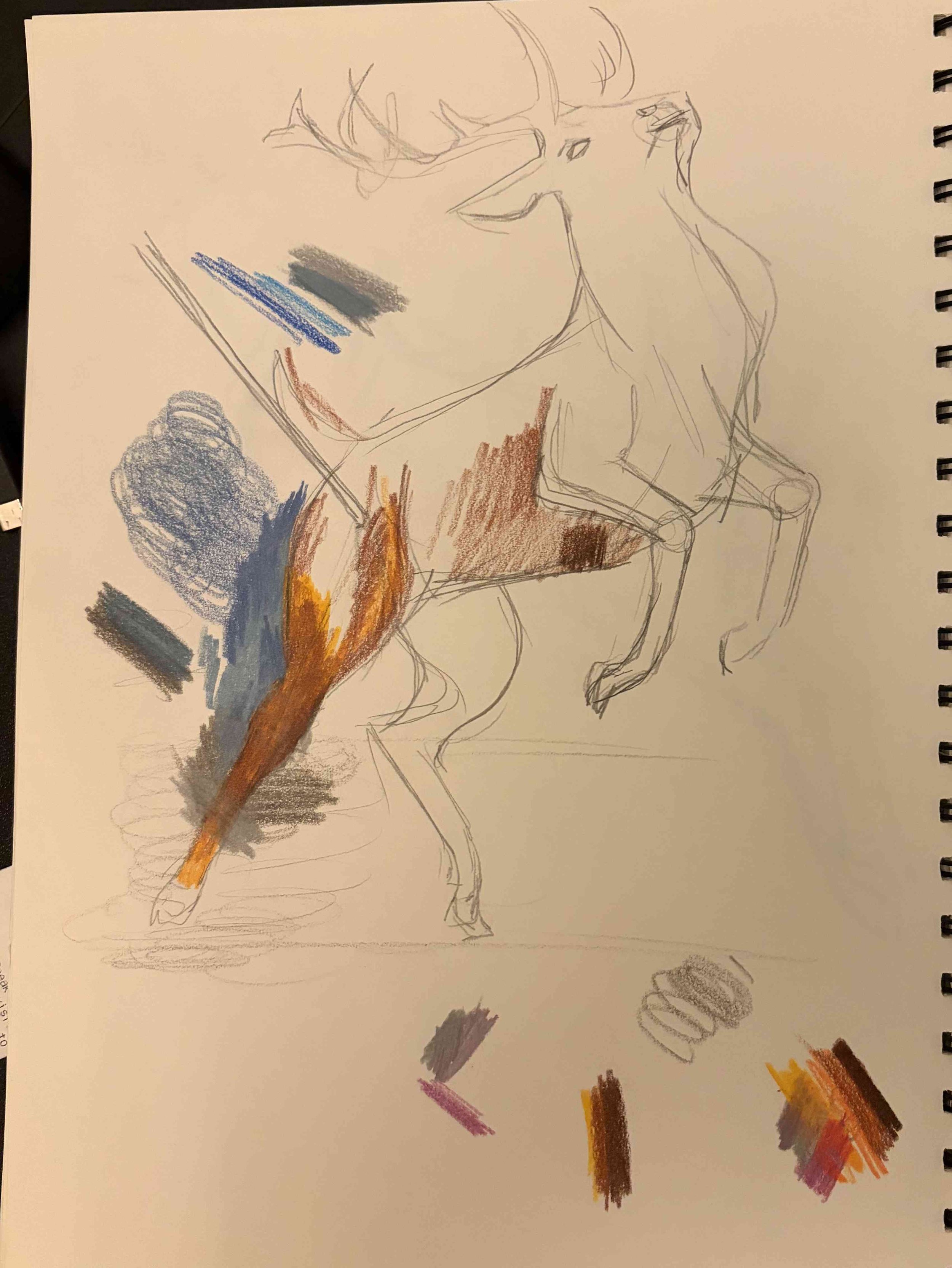
Putting those two together worked out much better, and I think convey more of a sense of anguish from the character with his injury. I think I also did a better job in this sketch of capturing the straighter body shape of a deer, while retaining the musculature of the chest area.
Scale
Another aspect that was tricky about this illustration is one of scale. The character is described as huge and imposing. The issue with trying to convey that is that there are no other elements that the view can reference to show size in the image; nothing to compare him with. I spoke in this blog post about keeping images very simple and focused. I didn’t want anything else in the frame besides the character himself, so I had to use another method to convey scale.
I took a character design class when I did a year long illustration course at Algonquin college many moons ago, and that was one of the lessons I retained is if a character is huge, you cannot simply scale up all body parts, as this just makes them look average sized; if everything is big, then nothing is big. You must instead provide contrast to show the largeness of the character.
Large characters usually show this by having comparatively very dainty hands and feet or small heads. If the character is especially muscular, the hips are often very slim (think Johnny Bravo).
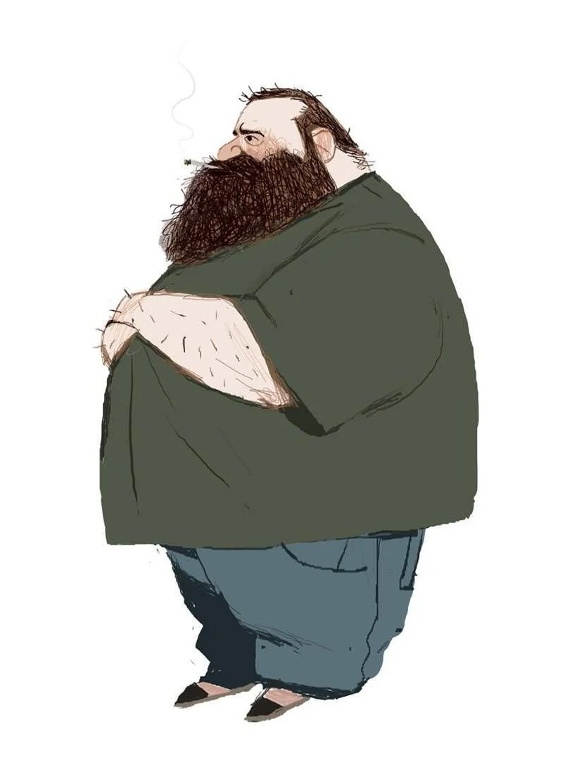
Image © Jules Rigolle
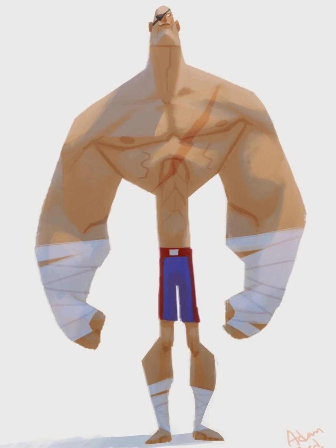
Image © Adam Ford
I didn’t want to do something quite so cartoonish, but my hope was to show a bit of contrast through subtle changes. I tried to convey the character’s hugeness through some elements I made small. The reference image of the head shows quite a large ear; I shrunk the ear of my character down for the final image.
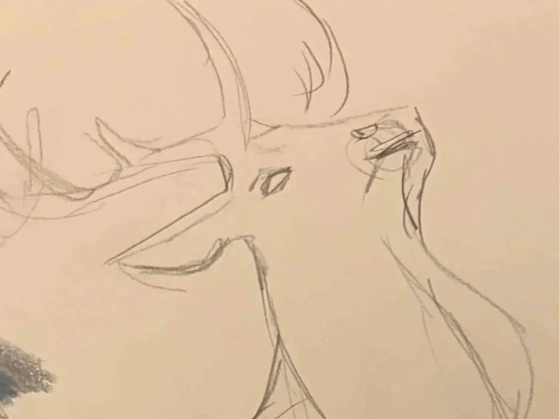
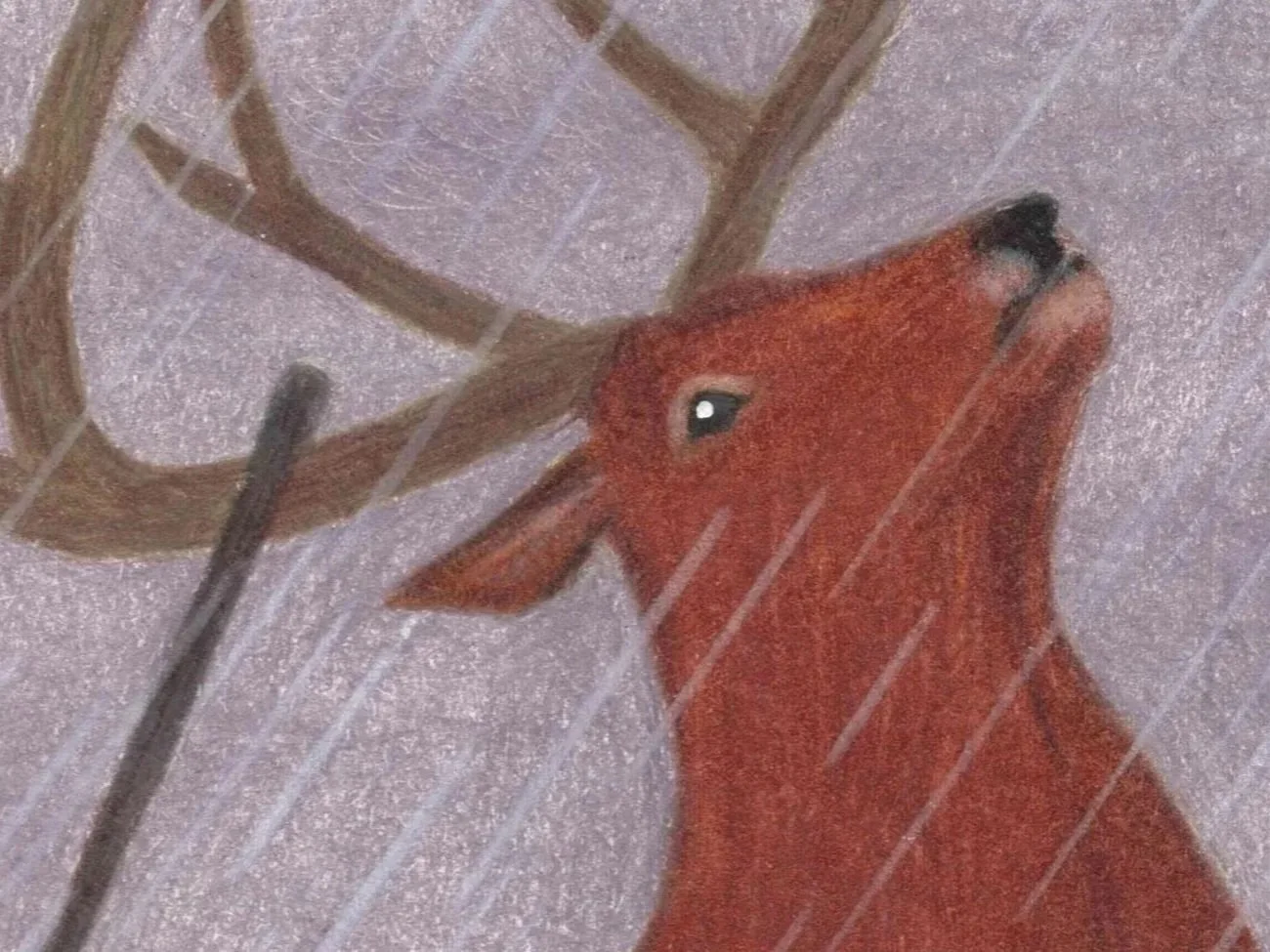
I did the same thing to the hooves. I feel this also helped the feet look more deer-like. Horses seem to have much more pronounced ankle joints and larger hooves, where deer have daintier feet, so bonus points for that choice.
Species
Another aspect of the illustration is what type of deer this would be. The reference image I used for the neck and head is a European Red Deer species. All the animal characters in the book are purposefully Canadian. To remedy this I brought in two more references for an North American White Tail deer, one for the tail and the other for the antlers.
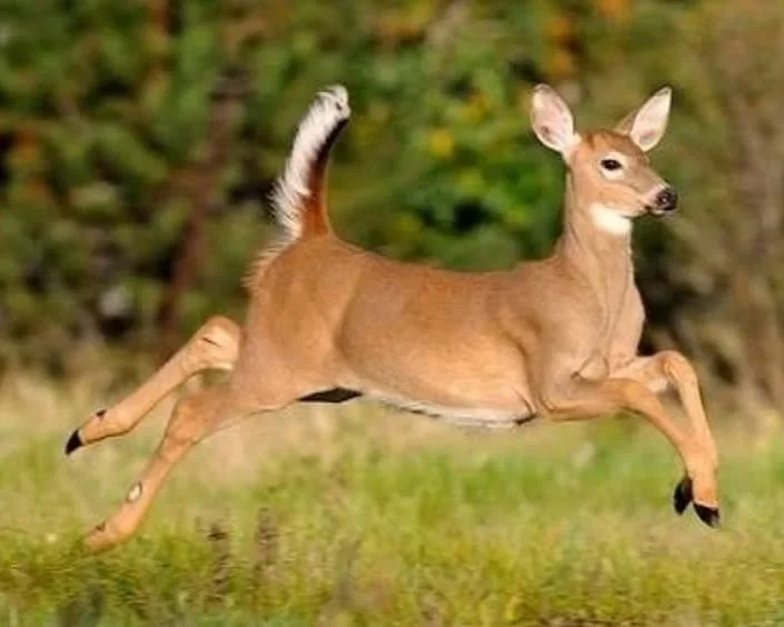
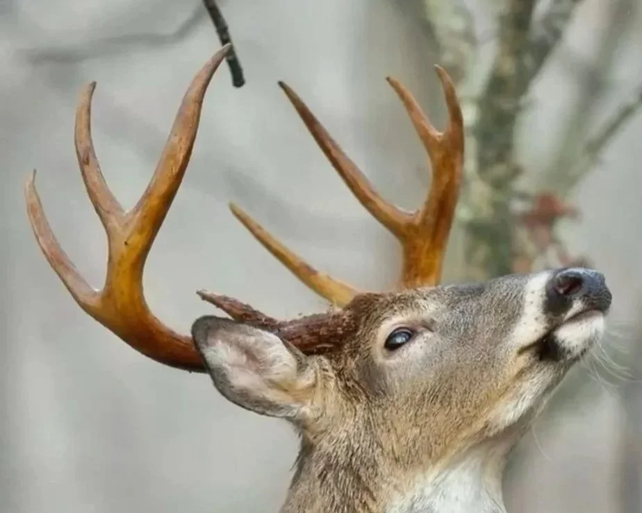
Photo © Matt Hansen
I did debate having a visible tail at all, as I wasn’t sure a deer would have a tail raised like that when injured. But I looked it up, and whitetail deer apparently will still have their tail flashed up if they are hit in the leg or elsewhere that is non-fatal, so I decided to include it.
Everything else
The last couple of reference images I used were for the background and the spear. The battlefield in this scene is quite smoky, so I used a reference photo from a wild fire to try and reflect that. And lastly, I found this image of a French spear housed in the Met.
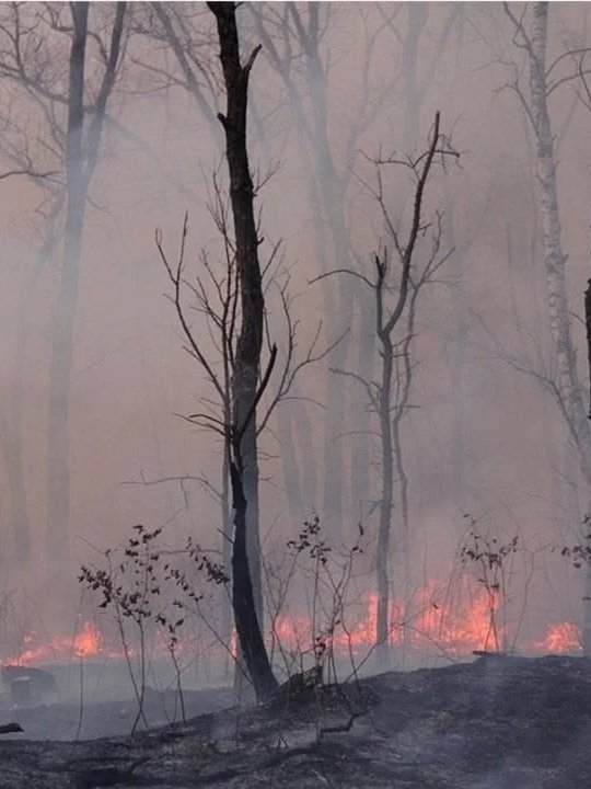
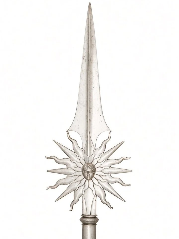
Just for fun, I made a little monstrosity to show how all the reference images fit together:
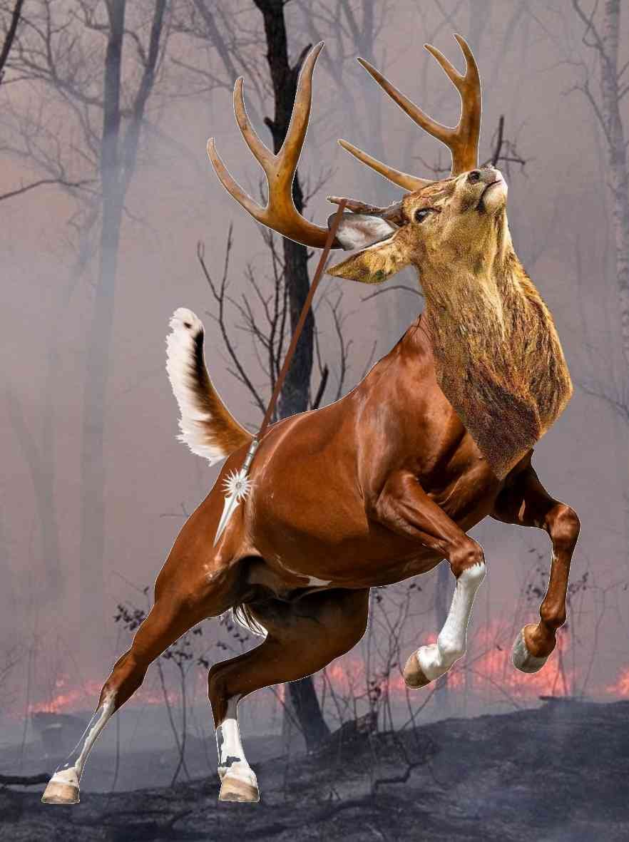
Other than that, the details like the hooves themselves, the drifting smoke, and the rain didn’t have direct reference. For textural elements or anatomical elements where getting an exact reference (four hooves of the same deer in very specific positions), I just look at many different images and do my best to get to something that looks good enough.
The point
I wanted to show the process of cobbling together all these different elements because I thought it would be kind of interesting to show a process. These illustrations crafted together over iterations, and awkward first stabs are necessary to get to a more polished product. The illustrations I have up now may not even be the final ones I publish, but the more trial and error goes into each one, the better the end product will be. There are definitely things I would change in this image if I did it again:
it doesn’t make sense for the spear to be casting a visual shadow in these lighting conditions,
there is a lack of expressiveness in the eye,
overall the anatomy of the head is not well defined, and
some of the dynamism of the reference photo was lost in the leg/hip area.
But I like the illustration well enough. If you are an artist, I highly recommend getting as un-precious about your process as soon as possible. It’s much more fun to take a Ms. Frizzle approach to these things; take chances, make mistakes, and get messy.
I also wanted to put together this post because it demonstrates what I was trying to say in this entry. Any piece of art, no matter how simple, has many micro-decisions associated with it. This even down to the level of putting pen to paper: any time you are holding a pen or a brush and putting pigment on a page, you are deciding where it goes, how much pressure to apply, and when to stop.
Thanks for reading :)